Alphabet Palette: Examining The Models Of Color

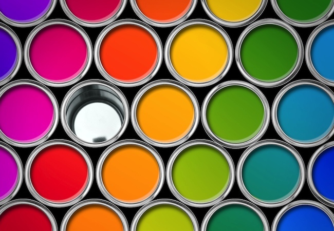
Color models revolve around primaries, a group of colors which, when mixed, create further derivative colors. Each color model has its own set of primaries, the initials of which give the color model its name.

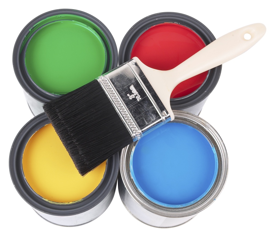
Each color model is sorted as additive or subtractive, which is based on how color is derived from a particular wavelength of light being reflected and perceived by the human eye. Paint and ink employ a subtractive model, which involves the physically mixing different pigments to create color, whereas computer screens employ an additive color model that involves mixing different wavelengths of light to create color.

3
Image source: hgtv.com

This leads to peculiar situations wherein mixing colors in one medium does not always yield the same result as the other; mixing green and red light, for instance, produces yellow, which is a far cry from the brown created by mixing red and green paint.

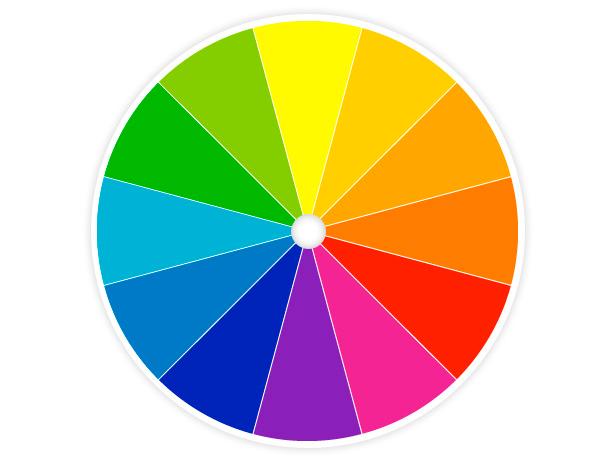
Perhaps the most familiar color model to the layperson is the RYB color model, popularized in wheel form by Sir Isaac Newton. Its primaries are red, yellow, and blue, which are often the first things to come to mind when one hears the word “primary color.” It is quite limited in scope; thus, it has largely been superseded in other graphic disciplines. It remains the principal color model used by artists and paint stores.

Extensively employed in the modern print industry, the CMYK model yields a broader assortment of colors. It retains yellow as a primary but swaps blue and red with cyan and magenta, respectively. The K stands for “key” and designates the color black. While black is formed from the combination of all three primaries in the model, in practice it is treated as a separate color to save on ink and to produce higher contrasts.

4
Image source: worqx.com

Because of the differences between them. Converting from one color model to another can be a challenge. Tools exist to help individuals approximate CMYK tones to paint Pantone’s.

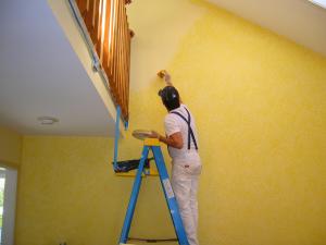
Steve Silvers is the owner of Paint Squad, a painting service that caters to the needs of both homes and businesses. Visit this blog for more updates on important painting considerations.

Color Contrasts For Eye-Popping Interiors

Contrasting colors can help details pop out in a room, working well with both flat walls and walls with intricate ornamentation. A room can achieve harmony and aesthetic balance through the judicious use of color contrast in the walls, fixtures, and furnishings.
Contrasts can be achieved in an interior space through a variety of means. Moldings in otherwise flat walls can be painted a complementary or contrasting color to form visible borders and lines. A contrasting color scheme works exceptionally well in showcasing the details in intricately detailed paneled walls. Even flat walls painted a single color can be paired with furnishings of a contrasting color palette.

85242377995120c1ca12e3fd70254e5d0c7c1e4e
Image source: apartmenttherapy.com

Contrasting colors can also define spaces and focal points within large rooms. Painting one wall a contrasting color to the other walls can easily turn it into an accent wall.
The common feature in all good palette contrasts are how easily the colors are distinguished from one another. Popular color contrasts include differences in color intensity, hue, and warmth, and can incorporate both a palette of multiple complementary colors or a monochromatic series of shades. The contrast between lighter and darker tones is a popular choice.

1af6203ed9e542cb7278b128896415819167cdb0
Image source: apartmenttherapy.com

Moreover, effective color contrasts are hardly an excuse for eye-searing mashes of bright color. A beautifully coordinated contrast can be achieved without involving bright, saturated palettes. Muted pastel colors can work just as well complementing each other as they would be complementing more vibrant counterparts.
Founded by  Steve Silvers, Paint Squad delivers gold-standard commercial and residential painting services to clients throughout the Los Angeles area. Visit this blog for more updates on painting interior spaces.

Disastrous Mistakes When Painting a Home

Image source: hometriangle.com

A lot of home owners are tempted to turn interior painting into a DIY endeavor. Although professional painters are highly recommended, home owners can still hack it. They just need to be careful, and avoid making the following mistakes that could end up costing them time and money.

Prep time separates most non-professional painters from the pros. More often than not, people with little-to-no experience painting homes forget to clean walls, scrape off peels and cracks, apply painter’s tape, and wait for patching compound to dry.

Purchasing low quality brushes and roller covers just won’t cut it, even if the home owners have the highest-quality paints in the world. Another benefit of high-end brushes and roller covers is the coverage they provide, which helps owners save on paint.

Image source: canoesongs.ca

Starting without primer can be a big problem since it covers surface flaws and allows for a smooth finish that lasts. The only time when paint can be mixed with primer is when the old surface had been painted once before, and has a flat, non-glossy finish.

Dipping the brush too deep into the paint is wasteful. Instead, peohttp://www.canoesongs.ca/wp-content/uploads/2014/12/painting-mistakes.jpgple can plunge the brush a third of the way, and it’ll have enough paint.

Painting without direction is also a sign of an immature painter. Pros know that the ceiling is the proper place to start, before moving downward. This allows for a smoother finish than if you start anywhere else.

Steve Silvers runs a company called Paint Squad, which provides quality and innovative painting projects for households. Learn more about Silvers and Paint Squad by following this Facebook page.

Choosing The Appropriate Paint Finish For Your Home

Besides color, one of the many considerations to make when painting is selecting the right finish. Paint finishes come in three types. Each of them comes with their own unique effects and maintenance requirements, thus making them appropriate for different kinds of paint jobs.

3
Image source: bobvila.com

Matte paints provide a relatively simple, nonreflective finish and display color well regardless of the lighting conditions. Their flat, light-absorbing appearance is good for hiding imperfections such as uneven textures, joints, and patches. These finishes, however, are not particularly durable or particularly resistant to staining, necessitating careful cleanups. A flat finish is ideal for rooms that require a velvety, old world feel and is recommended for ceilings, accent walls, and low-traffic walls.

Glossy finishes are the most durable, holding well against humidity and is relatively easy to clean. This makes it the perfect choice for high-maintenance or high traffic rooms prone to dirtying such as bathrooms and kitchens, as well as for items like doors and moldings. However, because of its shiny, reflective appearance, it readily calls to the viewers’ attention all flaws within the surface. Thus, areas with gloss finishes should be carefully prepared beforehand, and the paint carefully applied.

paint
Image source: home.wikia.com

A good compromise paint is eggshell or low-luster satin. They provide the same appeal and have the superficial finish of a flat paint job from a distance but have the durability of a full gloss paint job. Although their low-luster sheen still requires careful preparation and a good base, their balance makes them ideal for many rooms.

The founder and head of Paint Squad, Steve Silvers, understands the importance of proper prep work and paint selection to deliver the best finish to any room. For more updates on paint choices in interior and exterior remodeling works, visit this page.